Stochastic Solutions

Errors of Interpretation II:
Errors of Communication

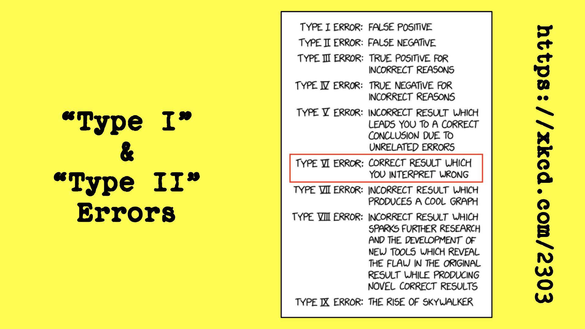
A correct result that is misinterpreted can be as harmful as an incorrect result.

Errors of Communication

Here are a few examples of errors of communication, taken from a talk Nick Radcliffe gave to the 2023 Toronto Conference on Reproducibility:

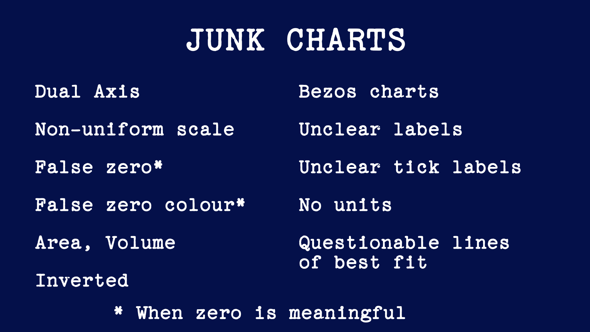
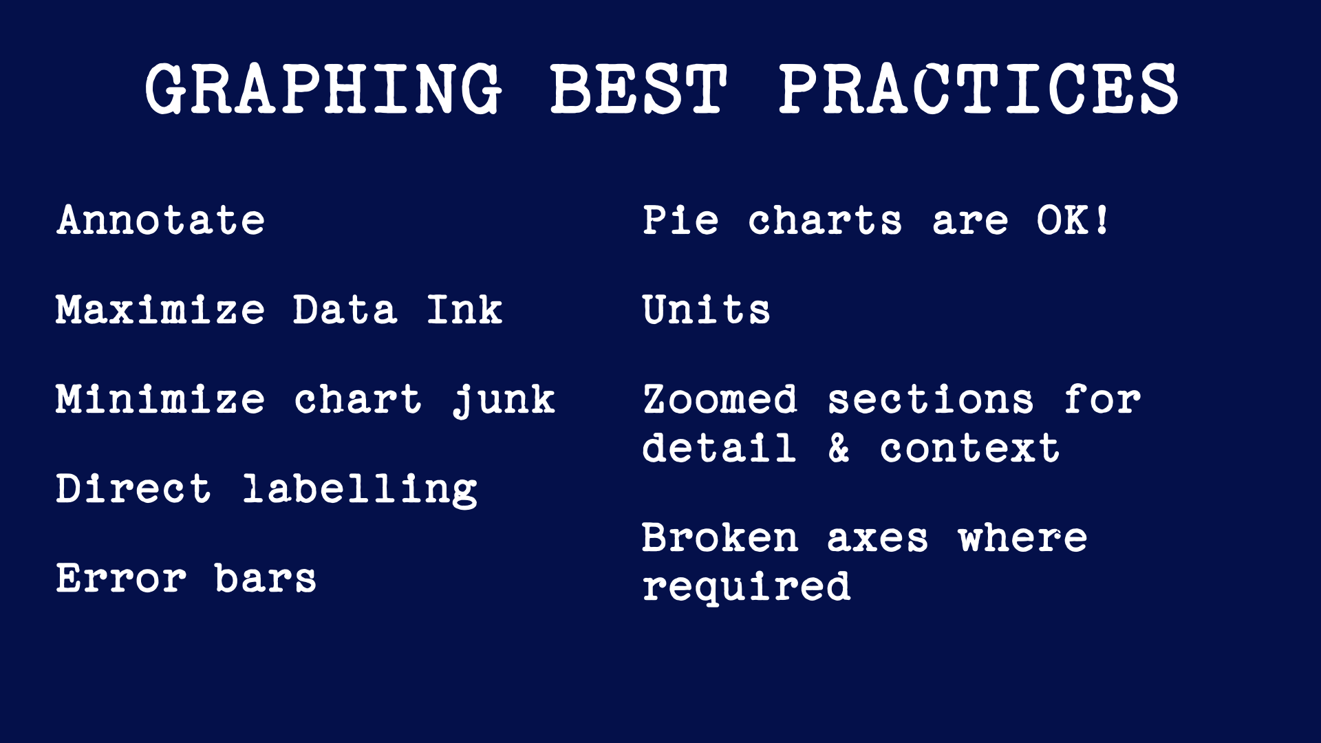
Errors of Interpretation (a.k.a. Type VI Errors)

The Mars Climate Orbiter

In 1998, the Mars Climate Orbiter was lost because NASA worked in SI units while its contractor Lockheed Martin works in imperial units, at a cost of about $125m (USD, 1998). Report

A picture of a rocket labelled Mars Climate Orbiter, Then NASA (SI) Newton-seconds vs. Lockheed Martin (FPS): Pounds (force)-seconds

Units and Dimensions Matter

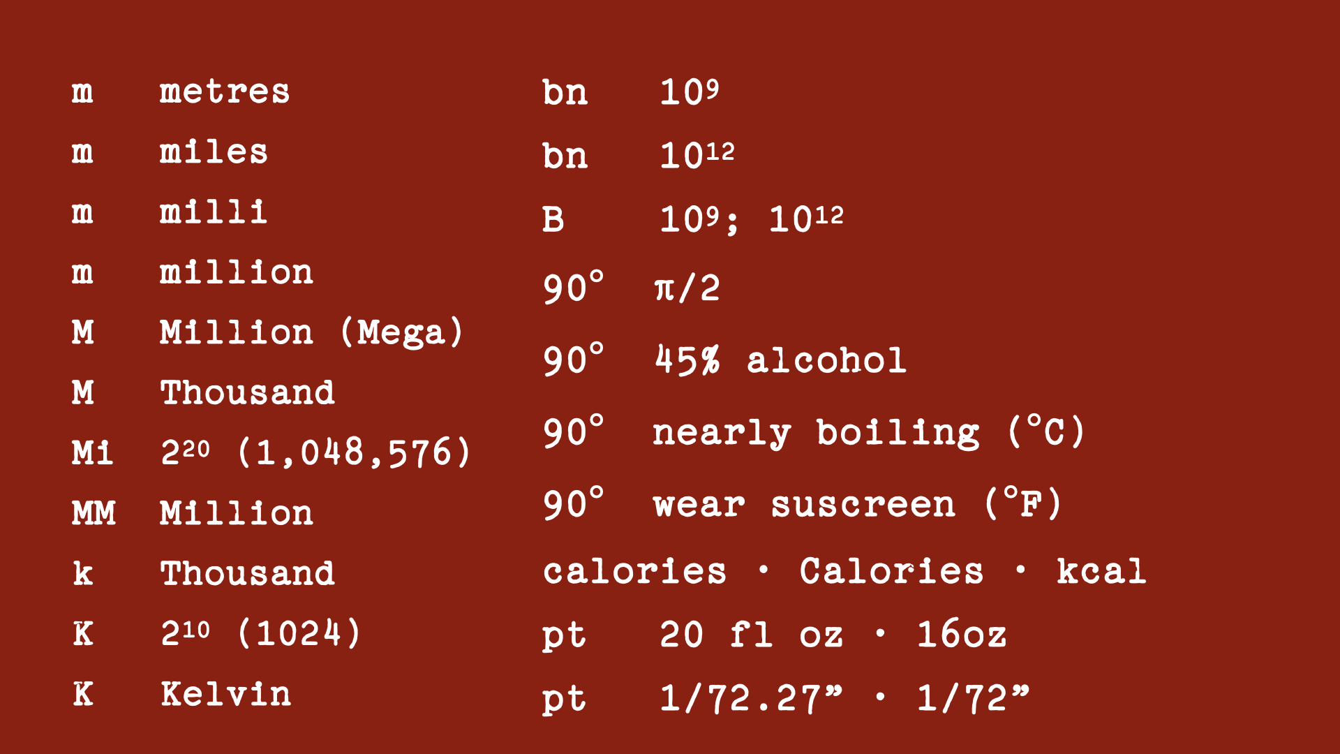
What do these prefixes mean?

Lists of ambiguous prefixes like m (metres, miles, milli, million), M (Million (Mega) and Thousand) etc.

Probability of Landing Safely?

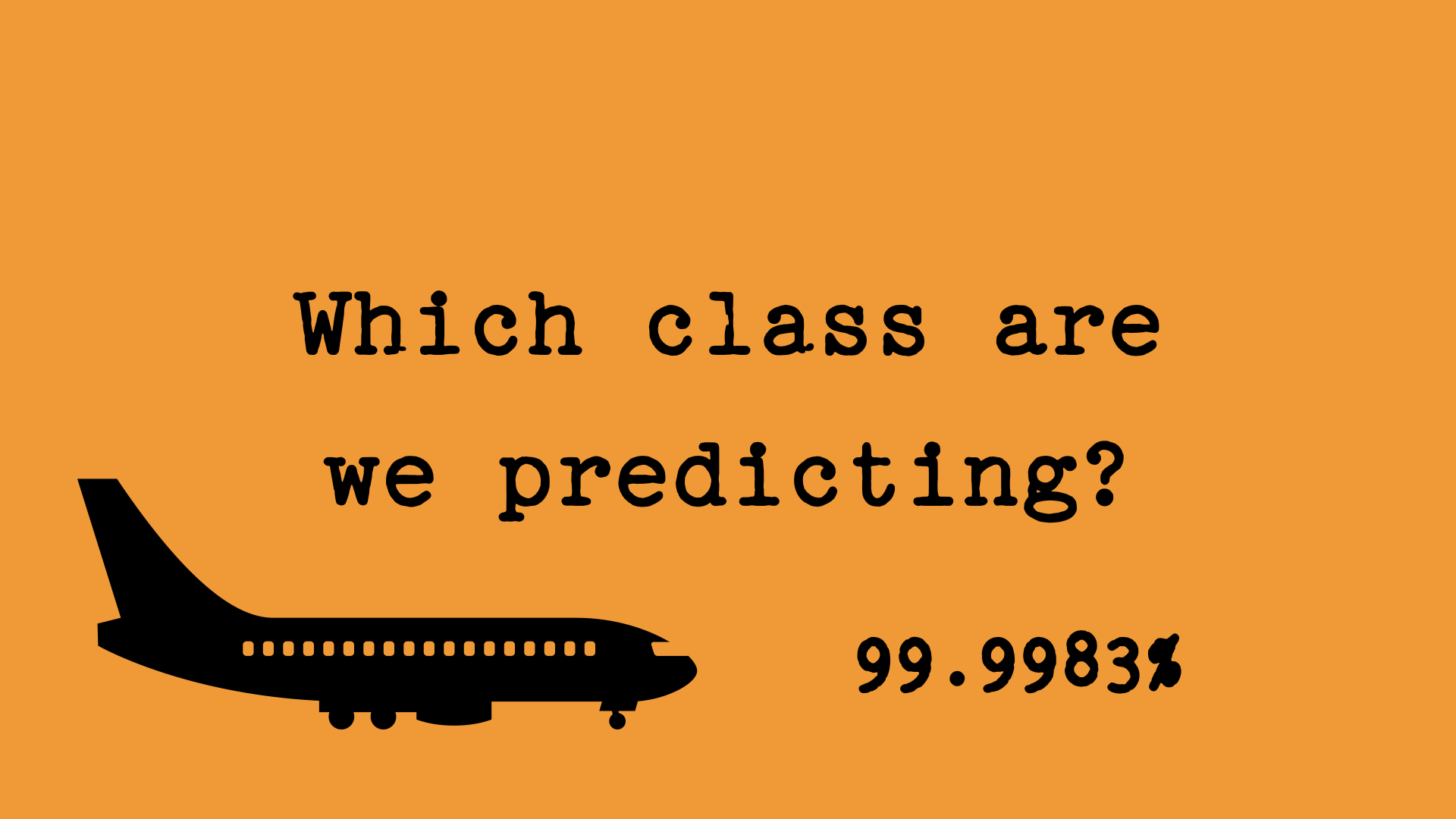
or probability of crashing? You’d want to know.

Picture of an aeroplane with ‘Which class are we predicting’ by it, and the figure 99.9983%.

Regression to the Mean

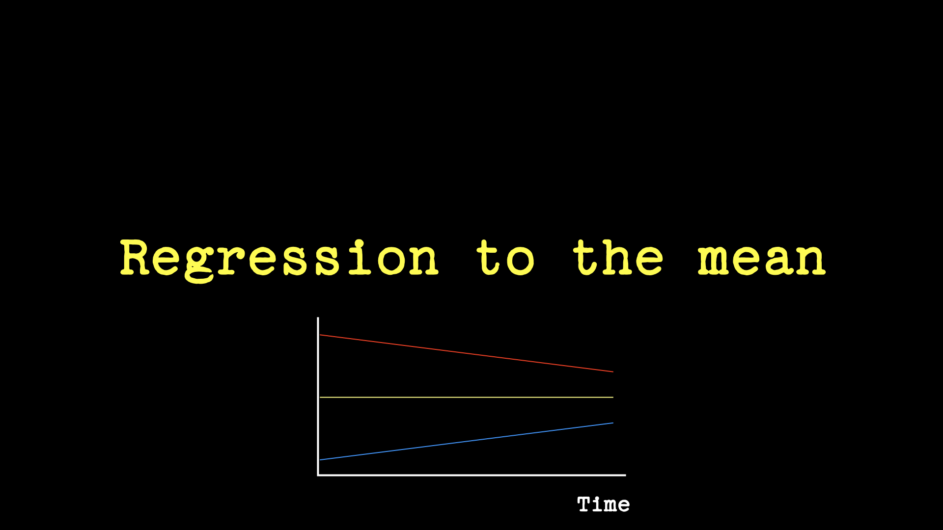
When a population is segmented on some variable, e.g. spend, and then measured again later across the previously-allocated segments, the values for the segments are likey to be more similar because of regression to the mean. This is usually not a novel or meaningful finding.

A sketch line graph labelled ‘Regression to the Mean’ with Time on the x-axis and one horizontal line, above it a downward-sloping line and below it a climbing line.

There’s always an xkcd for it.

Randall Munroe nails it: https://xkcd.com/2303. Those errors of interpretation that are errors of communication are also “Type VI” errors.

xkcd.com/2303 “Type I and Type II Errors”. This lists errors of type I to IX with Type VI error (highlighted) defined as ‘Correct result which you interpret wrong’

What is this Date?

Those who fail to learn lessons from history, and those who learn the wrong lessons, are doomed to repeat it.

Text: 01/02/12

Significant Figures and Spurious Precision

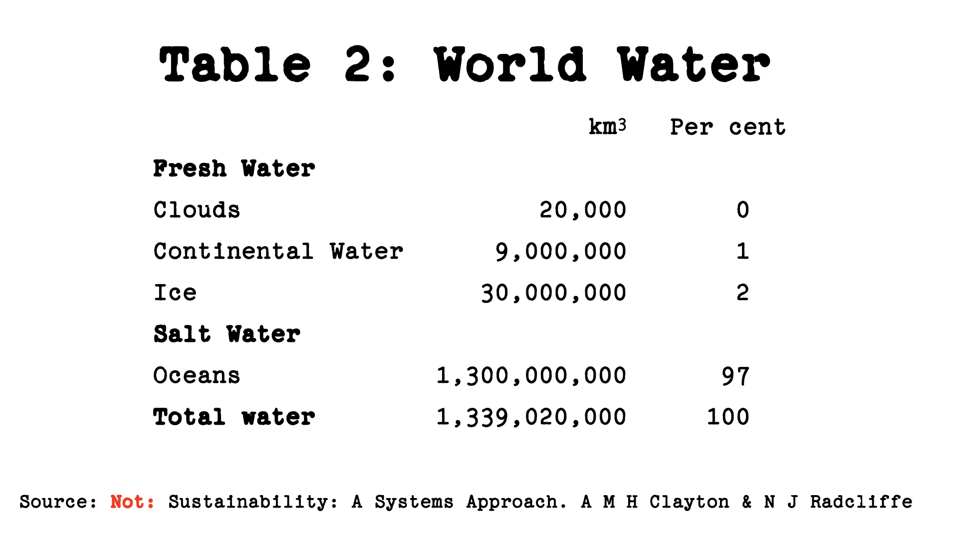
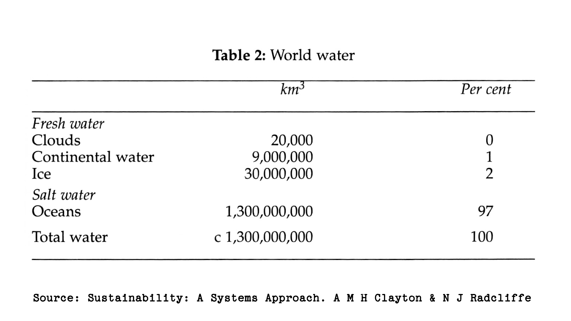
Each digit in the total shown comes from a single line of data, and those water bodies are of different orders of magnitude. The zeros in the non-total lines reflect significant figures, and the key takeaway is that 97% of all the Earth’s water is in oceans, not that the volume is known to 6 significant figures. (It is not.)

Table 2: World Water. This shows a table with volumes in cubic kilometres listed as Clouds (20,000), Continental Water (9,000,000), Ice (30,000,000), Oceans (1,300,000,000) and a total 1,339,020,000. Underneath it says Source: Not: Sustainability: A Systems Approach. A M H Clayton and N J Radcliffe

Essentially the same tables as the last image except with the total replaced by c. 1,300,000,000, and ‘Not:’ removed from the attribution.

Relative and Absolute Percentage Changes

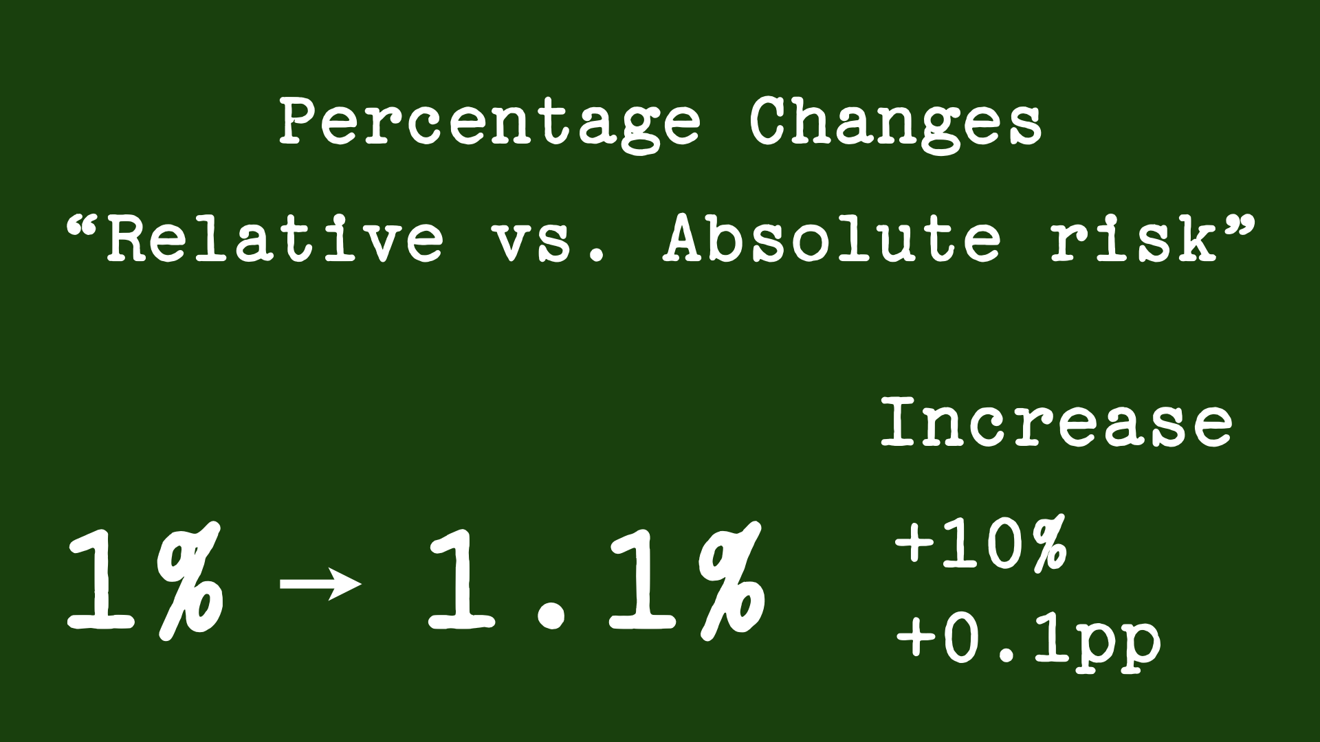
Be careful talking about changes in percentages.

Percentage Changes: “Relative vs. Absolute risk“. In large type: 1%  → 1.1%. Then Increase: +10%; +0.1pp.

Junk Charts

are everywhere. Learn how to avoid making them.

Heading: JUNK CHARTS. Body:
Dual Axis. Non-uniform scale. False zero. False zero colour. Area, Volume. Inverted.  
Bezos charts. Unclear labels. Unclear tick labels. No units. Questionable lines of best fit.
Underneath: * When zero is meaningful

Graphing Best Practices

Learn what they are.
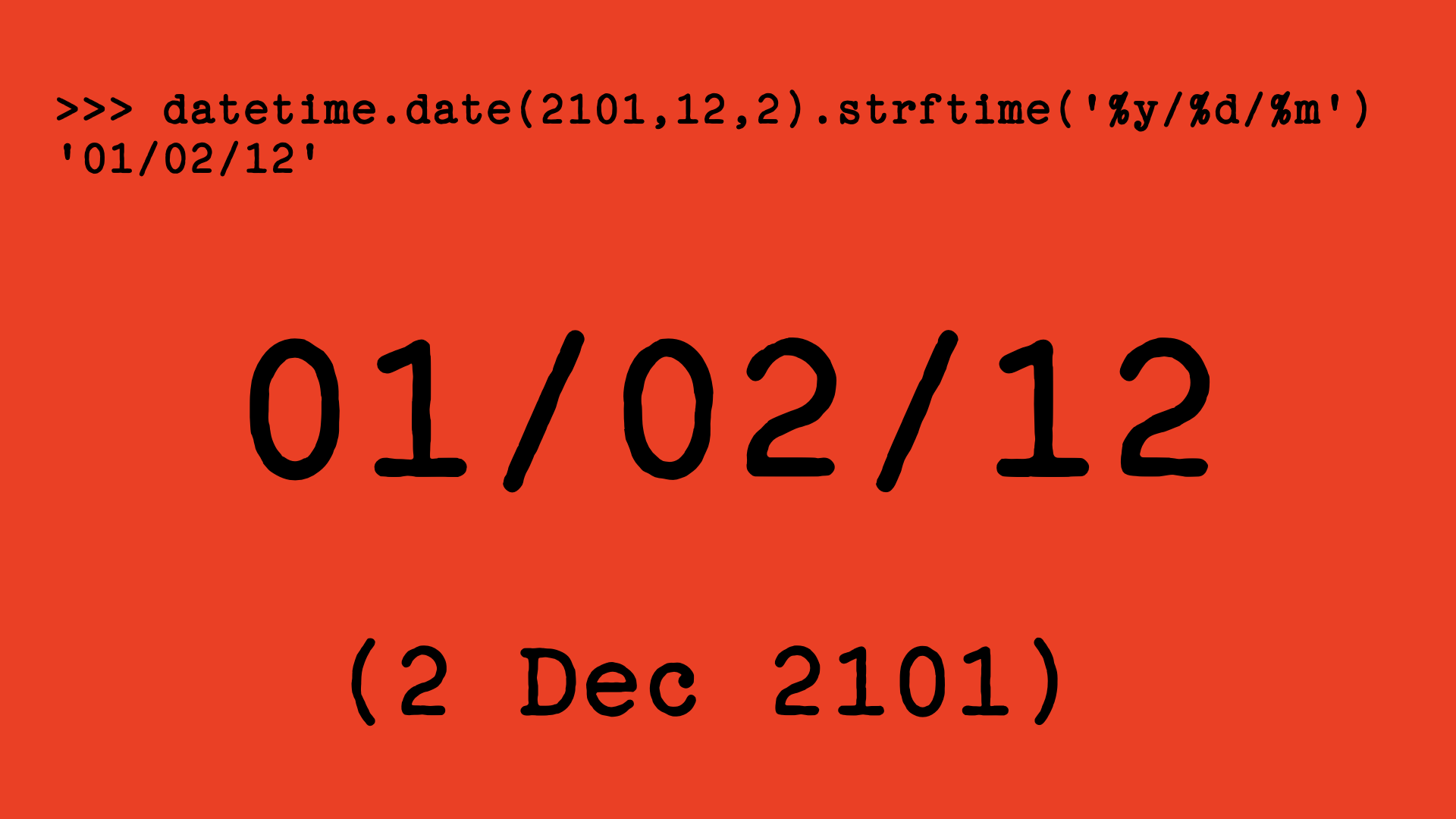
Heading: GRAPHING BEST PRACTICES. Body:
Annotate. Maximize Data Ink. Minimize chart junk. Direct labelling. Error bars.  
Pie charts are OK! Units. Zoomed sections for detail & context. Broken axes where required.

Never Use 2-digit Dates

Seriously. ISO8601 is almost always the right choice in data.

Top: >>> datetime.date (2101,12,2).strftime('%y/%d/%m')
'01/02/12'
Middle: 01/02/12.
Bottom: (2 Dec 2101)

Never Use Dual-Axis Graphs

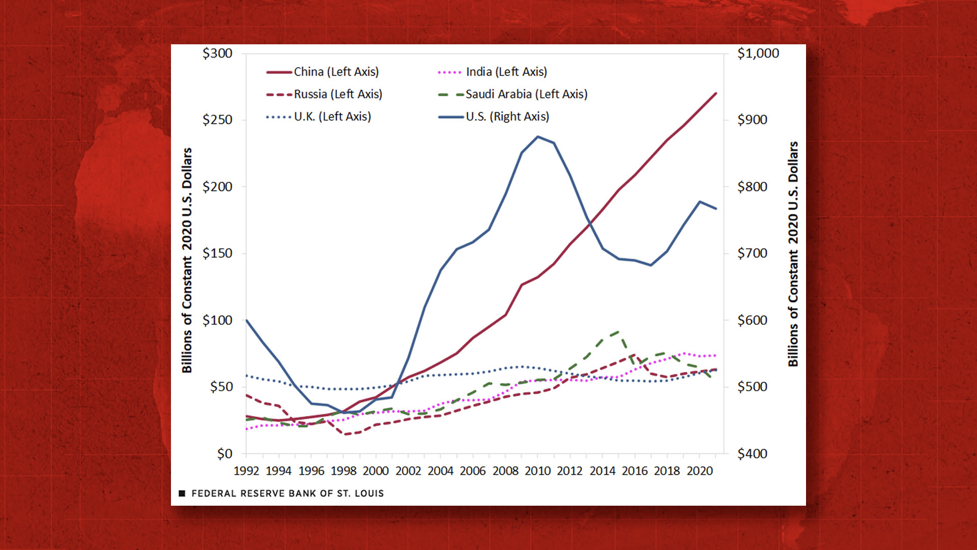
In 2022, who is spending more, US or China?

A dual axis chart from the Federal Reserve Bank of St Louis with a left-hand axis running from 0 to $300bn and a right-hand axis running from $400bn to $1,000bn. China appears, visually to overtake the USA, but the China data is labelled

Never Invert the Axis

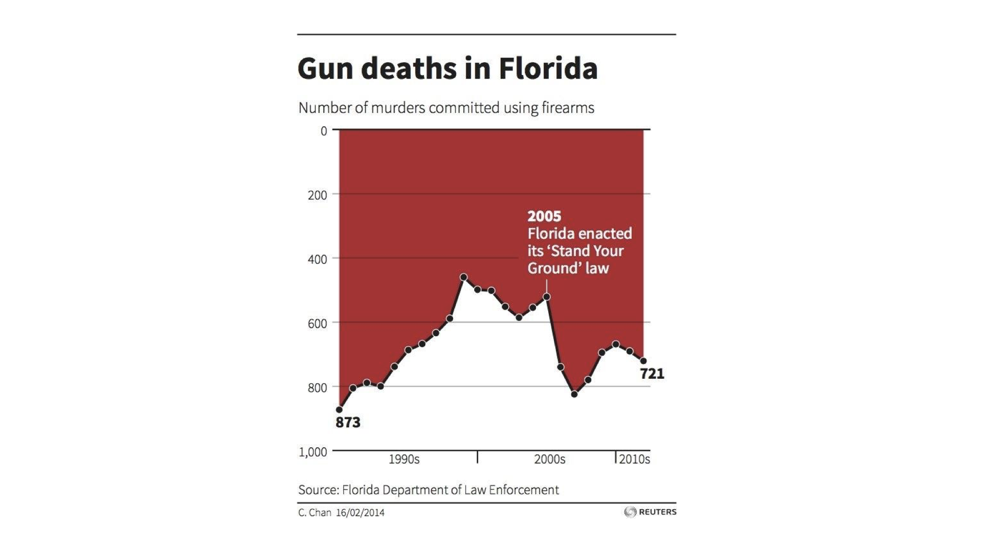
What happened to gun deaths after Florida introduced its Stand Your Ground law?

A graph labelled Gun deaths in Florida as a vertical axis that is 0 at the top and 1,000 at the bottom, with initial and final labelled values of 873 (1990s) and 721 (2010s). 2005 is labelled as ‘Florida enacted its “Stand your Ground“ law'. There is a sharp increase in gun deaths immediately after the law was enacted, which is shown on the graph as the line going from further up the page to lower down the page. Source: Florida Department of Law Enforcement.

Further Reading and Checklists

Two chapters of the book, Test-Driven Data Analysis of the TDDA Book are specifically concerned with errors of communication.

Additionally, several of TDDA’s Checklists are directly relevant to this topic. Those specifically about errors of communication are:

In the case of errors of process, the most relevant checklists are:

Additionally

covers both classes of errors of interpretation (formulation as well as communication).

Work With Us

If you would like help with data science that is communicated clearly, talk to us. We cannot guarantee we will produce outputs so clear they are impossible to misinterpret, but we take output quality seriously and have the scars on our backs from errors of communication we have witnessed, been subject to, and—yes—occasionally committed ourselves. But we have written the book on how to avoid them.

Company number SC329851. Registered office: 16 Summerside Street, Edinburgh, EH6 4NU.
Copyright © Stochastic Solutions Limited 2007–2026.